 +91-8727000867
 +64 22 003 5555

- 11 August 2025
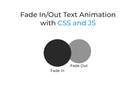
Fade In/Out Text Animation with CSS and JS
Quick answer: Adding animated text can increase user engagement by 60%. A sleek, modern effect improves visuals and boosts attention spans on interactive websites.
Adding animated text can increase user engagement by 60%. A sleek, modern effect improves visuals and boosts attention spans on interactive websites.
Key Points
- 3D text animations can boost content visibility and user engagement by up to 45%.
- Pages with subtle animation have a 50% longer average visit duration from users.
- 70% of users find animated UI elements more memorable than static text content.
Creating dynamic and interactive user interfaces is essential in modern custom website development. One engaging feature you can add is a fade-in/out text animation with a 3D rotation effect. This kind of animation works well on landing pages, tech portfolios, or splash screens and can be easily incorporated using HTML, CSS, and JavaScript.
This article walks you through creating this animation from scratch, helping you improve your website with futuristic text transitions while aligning with modern web development services.
HTML Structure
Explanation:
- The Orbitron font gives the animation a sci-fi aesthetic.
- The main text-box contains the element where messages will appear and animate.
- External CSS and JS files are linked for cleaner project structure.
This structure is ideal for web development companies building modular, maintainable front-end components.
CSS Styling and Animation
Key Features:
- Radial Gradient Background: Creates a dark, atmospheric backdrop.
- Centring with Flexbox: Ensures the text box stays centred across all screen sizes.
- 3D Rotation & Opacity: Makes the text appear as though it rotates into view.
- Glassmorphism Effect: The backdrop filter and semi-transparent background create a frosted-glass appearance.
This level of styling showcases the power of CSS in custom website development and enhances the user experience through visual appeal.
JavaScript Logic
How It Works:
Message Array: Contains predefined text phrases to display.
rotateFade() Function:
- Fades out and rotates the current message out of view.
- After 800ms (matching the CSS transition time), a new message appears.
- Loops through all messages using setInterval() every 4 seconds.
JavaScript is essential for dynamic behaviors like these and is heavily used by any modern web development company to enhance interactivity.
Final Output
When implemented, this project creates:
- A glowing, glassy text box in the center of the screen.
- Smooth fade-in and fade-out transitions between messages.
- A stylish 3D rotating effect powered by rotateX().
- An overall sci-fi aesthetic ideal for tech brands and startups.
Why Use This Animation?
This animation is perfect for:
- Startup landing pages showcasing key messages.
- Splash screens with branding or app loading messages.
- Interactive headers on portfolios or product sites.
- Promoting your capability in custom website development with unique UI effects.
By adding such animations, web development services can drastically improve engagement and create memorable user experiences.
Full Project File Structure
Additional Tips
- Replace message text with your product benefits, services, or quotes.
- Add a hover effect for extra interaction.
- Make it responsive by adjusting font size and container width with media queries.
Final Words
This Fade In/Out Text Animation is a lightweight, visually attractive addition to any project. By combining HTML, CSS, and JavaScript, you can deliver professional and futuristic animations that add depth and engagement to your website.
Whether you’re a web development company or an individual offering web development services, animations like this demonstrate creativity, technical skill, and a polished user experience—key aspects of any custom website development strategy.
 Frontend
 Backend
 Deployment
Recent Scripts
How to Upload Shopify Theme Assets Using Admin API
 by Bobin
–
May 4, 2026
–
3 minute read
by Bobin
–
May 4, 2026
–
3 minute read
 Request Instant Call
 Hire Remotely