 +91-8727000867
 +64 22 003 5555

- 31 May 2025
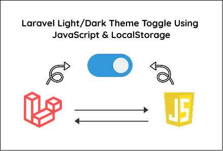
Laravel Light/Dark Theme Toggle Using JavaScript & LocalStorage
Quick answer: <h2>Get a summary via Google for</h2> <p class="dollar">$0</p>

Implement a Laravel light/dark theme toggle using JavaScript and LocalStorage for persistent, user-friendly UI preferences without external libraries or frameworks.
Key Points
- Over 80% of users prefer dark mode to reduce eye strain during extended use.
- Using LocalStorage ensures user theme preference persists across sessions without server load.
- Laravel powers over 8 million websites worldwide, enabling easy integration of UI features.

Web Developer
Pragati S.
3 min read
3+ yrs of crafting high-performance websites with clean code and modern tech—turning ideas into digital experiences.
Dark/light theme toggles have become essential in modern web and app development, offering users control over how they interact with a platform. Whether you're building a personal website, an enterprise dashboard, or working on custom mobile app development, this guide will help you implement a user-friendly theme toggle using PHP (Laravel), CSS and vanilla JavaScript.
This simple, framework-free solution is ideal for on-demand app development projects that prioritize speed, customization and performance.
Planning to hire a developer? Discover the 5 common mistakes to avoid when hiring a web developer to ensure a smooth project.
Step 1: Create a Blade View File with Toggle Logic
Start by creating a Blade file (e.g., resources/views/theme-toggle.blade.php). This will serve as the foundation for toggling between dark and light themes.
Here’s the complete view file:
Explanation of Key Sections:
-
HTML: Uses the data-theme attribute on the <html> tag to dynamically switch between light and dark themes.
-
CSS: Defines styles for light mode by default and overrides them when data-theme="dark" is set.
JavaScript:
- Retrieves the saved theme from localStorage (or defaults to light).
- Applies the theme on page load.
- Listens to the button click event and toggles the theme.
- Saves the selected theme in localStorage to persist it across sessions.
Step 2: Define a Laravel Route
Add a new route in routes/web.php to serve your view.
Visit http://your-app-url/theme-toggle to test the functionality.
How This Helps in App Development
Integrating a theme toggle feature is highly valuable when building custom mobile app platforms that require a modern user interface.
-
Improve user engagement by offering personalization.
-
Enhance accessibility for users in low-light environments.
-
Increase the perceived quality and professionalism of your app or website.
Using this approach, you avoid dependency on bulky CSS or JS frameworks, ensuring your application remains lightweight and fast, critical in mobile app scenarios.
Output Overview
-
Default Theme: Light mode on first visit.
-
Toggle: Switches seamlessly between light and dark themes on button click.
-
Persistence: Stores user preference in LocalStorage and applies it on every page load.
-
Framework Free: No reliance on TailwindCSS, Bootstrap, React, or other libraries.
Additional Tips for Your Projects
-
Customize the toggle button to include icons (e.g., sun and moon) for better UX.
-
Add CSS transitions for smooth color changes.
-
Use media queries like prefers-color-scheme to detect user system preference automatically.
-
For authenticated users, save the theme preference in your database to sync across devices.
-
Package this toggle as a reusable Laravel component or integrate it into your SPA frontend.
Final Words
This tutorial provides a clear and practical way to implement light/dark theme toggling in Laravel using simple CSS and JavaScript, perfectly suited for mobile app development.
By leveraging LocalStorage, the user experience is enhanced with persistent preferences, ensuring your app or website feels personalized and modern across sessions.
 Frontend
 Backend
 Deployment
Recent Scripts
How to Upload Shopify Theme Assets Using Admin API
 by Bobin
–
May 4, 2026
–
3 minute read
by Bobin
–
May 4, 2026
–
3 minute read
 Request Instant Call
 Hire Remotely