 +91-8727000867
 +64 22 003 5555
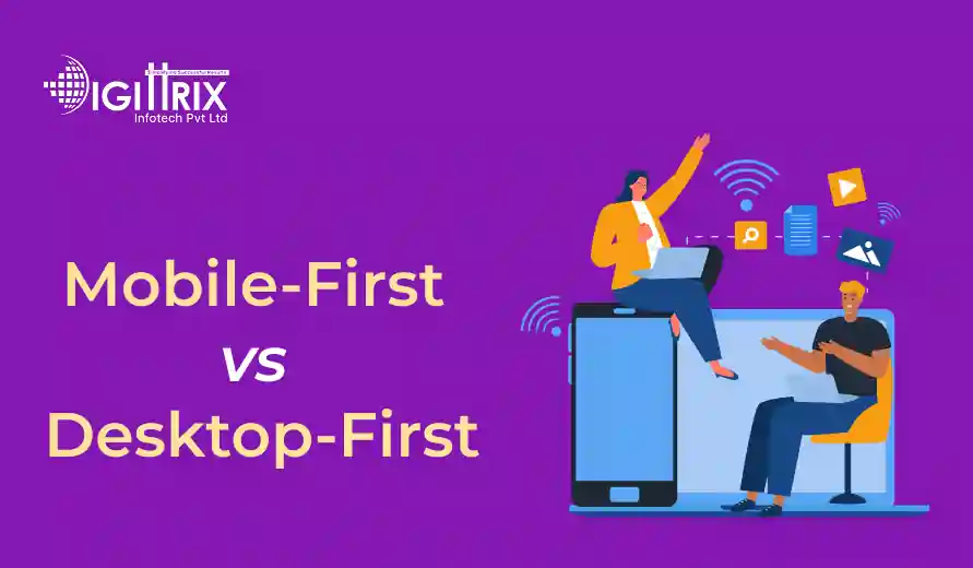
Mobile-First vs Desktop-First: Choose the Right Approach
Quick takeaway: Mobile usage makes up over half of global web traffic, but desktops are still important for complex tasks. Selecting the best approach depends on the audience and goal.
Explore the main Digittrix service areas connected to planning, building, and growing digital products.
Mobile app development | AI development services | Digital marketing & GEO services | ERP/CRM development services | 7-Day Trial SEO Packages
Highlights
- 58% of users access websites via mobile devices, demonstrating a mobile-first approach.
- 42% of web traffic comes from desktops, highlighting the importance of desktop design for tough tasks.
- 68% of users rotate between devices, promoting the adoption of integrated mobile and desktop strategies.

Co-Founder
Harsh Abrol 
Since 2014, Digittrix has helped companies optimise digital products for stronger conversions.
In today’s digital age, businesses and individuals need to carefully consider how users will interact with their websites and applications. The way people access information, shop online, or connect with services has evolved quickly over the past decade. With smartphones becoming an essential part of everyday life, more people now browse the internet and use apps on their mobile devices instead of traditional desktop computers. This change has led to two main approaches in design and development: mobile-first and desktop-first.
Both approaches have their strengths and weaknesses, and selecting the right one depends on your target audience, business goals, and the type of digital solution you are creating. This article provides a detailed explanation of these approaches, highlights their advantages and disadvantages, and helps you make an informed choice.
Discover more about enhancing mobile experiences in our guide on innovative mobile app features by Digittrix!
What is a Mobile-First Approach?
The mobile-first approach focuses on designing and developing digital platforms for mobile devices before expanding to larger screens like desktops. This method starts with an emphasis on smaller screens, limited bandwidth, and touch-based navigation.
The reason for this approach is simple: more users are using websites and apps on their smartphones. By focusing on mobile design first, developers ensure that important features and user needs are met within the limited screen space. Once this foundation is solid, the design is then adapted for larger screens.
For example, if you’re working on mobile app development, a mobile-first approach ensures that the app’s core usability is optimized for small devices, where most users will interact with it.
What is a Desktop-First Approach?
The desktop-first approach begins by designing for larger screens and then adapts the layout for smaller devices. Historically, this was the most common method because desktop computers were the main way people accessed the internet.
This method starts by designing complex layouts, large visuals, and interactive features for desktops. Then, the same elements are scaled down or simplified for mobile users. While this approach can work in some cases, it may lead to usability problems if mobile adaptation is not handled carefully.
For businesses that depend on detailed data dashboards, complex interfaces, or professional tools, a desktop-first approach remains useful. For example, website development services that create platforms for industries like finance or enterprise-level reporting typically start with desktop designs because these tools are mainly used on larger screens.
Mobile-First vs Desktop-First: Key Differences
Screen Size Prioritization
- Mobile-first: Starts with the smallest screen size and scales up.
- Desktop-first: Begins with large screens and scales down.
Performance Optimization
- Mobile-first: Focuses on faster loading times, minimal features, and responsive layouts for smaller devices.
- Desktop-first: May prioritize design complexity first, with mobile optimization handled later.
User Experience
- Mobile-first: Focuses on the fact that mobile users often seek quick actions, simple navigation, and lightweight content.
- Desktop-first: Offers a richer experience for larger screens but may not translate smoothly to smaller ones.
Development Focus
- Mobile-first: Perfect for businesses whose audiences mainly use smartphones, such as e-commerce or on-demand app solutions.
- Desktop-first: Suitable for industries where desktop-based platforms remain dominant.
Advantages of Mobile-First
- Meeting User Habits – Since most users access the web via smartphones, mobile-first design makes sure that the layout matches current browsing habits.
- Speed and Performance – Mobile-first design focuses on minimal resources, enabling web pages or apps to load quickly even on slower connections.
- Simplicity in Navigation – With limited space, designers focus on essential features to ensure a straightforward user experience.
- Better for Growth – Starting small and expanding to larger screens enables scalable development. It’s easier to build upward rather than cut features later.
Advantages of Desktop-First
- Rich Visuals and Layouts – Designers can utilize advanced graphics, animations, and complex layouts without concern for space limitations.
- Great for Data-Heavy Solutions – Platforms such as business dashboards or enterprise tools often need large displays, making desktop-first a practical option.
- Strong Control Over Design – Developers can add detailed features and adapt them for mobile later.
Challenges with Mobile-First
- Limited Space – Designers need to carefully prioritize features, as not everything fits on a smaller screen.
- Scaling Up Can Be Tricky – Expanding a minimal design to larger screens sometimes makes the interface feel empty if not planned properly.
- Complex Features May Be Omitted – Advanced functionalities might not be feasible in initial mobile layouts.
Challenges with Desktop-First
- Mobile Compatibility Issues – Scaling down rich desktop designs often creates problems with usability on smaller screens.
- Performance Problems – Mobile users may experience longer load times when desktop-heavy designs are forced onto their devices.
- Falling Behind User Trends – With more people on smartphones, businesses risk losing engagement if mobile optimization isn’t prioritized.
Which Approach Should You Choose?
The decision between mobile-first and desktop-first depends on your business type, target audience, and long-term goals.
Choose Mobile-First if:
- Your primary audience uses smartphones.
- You’re building an app or platform focused on accessibility and quick actions.
- Your project involves on-demand app development such as ride-booking, food delivery, or healthcare services.
Choose Desktop-First if:
- Your product involves detailed data visualization or enterprise-level tools.
- Your audience primarily accesses services via desktops or laptops.
- You’re offering website development services aimed at professional or industry-focused platforms.
Role of Development Services
Both approaches need skilled design and development to work well. Businesses today often depend on specialized teams that can develop solutions compatible with multiple devices.
For example, custom web development teams can create flexible websites that function well on all devices, whether you choose a mobile-first or desktop-first approach. Similarly, mobile app development experts ensure that applications deliver smooth performance and a user-friendly design across various operating systems and screen sizes.
The Balance Between Both Approaches
In reality, many businesses do not strictly adhere to a single method. Instead, they adopt a blended strategy based on their needs. For example:
- An e-commerce company may adopt mobile-first for its shopping app while using desktop-first for its analytics dashboard.
- A news website may design mobile-first for daily readers but still maintain a desktop-first layout for professional writers uploading content.
With custom web development, it’s possible to balance these priorities by creating responsive frameworks that adapt smoothly to both mobile and desktop environments.
Case Examples
- E-commerce Platforms: Online shopping platforms often prioritize mobile-first design because most purchases now happen through e-commerce mobile apps. Quick product views, simplified checkouts, and responsive catalogs are more important than desktop-only features.
- Corporate Dashboards: Business dashboards usually prioritize desktop views because managers and employees require large screens to examine reports, charts, and analytics. In these scenarios, mobile views act as supplementary tools for quick checks.
- Service-Based Apps: Ride-hailing, healthcare booking, and delivery apps typically rely on a mobile-first design. These services succeed through instant accessibility, aligning with on-demand app development strategies.
Future Trends
The gap between mobile-first and desktop-first is narrowing as responsive design frameworks grow stronger. Developers increasingly aim to create experiences that automatically adapt to the device in use.
Technologies such as progressive web apps, cross-platform development, and flexible layouts mean that businesses no longer have to strictly choose one side. Instead, they can create digital solutions that cater to both mobile and desktop audiences efficiently.
Discover the top trends in website design including AI, dark mode, and UX innovations in Digittrix’s blog!
Final Words
Choosing between mobile-first and desktop-first approaches is not about picking a winner but about understanding your audience and goals. Mobile-first is practical for businesses where smartphones dominate usage, while desktop-first is still valuable for industries that rely on large-screen tools.
By working with experts in website development services and Custom web development, businesses can create platforms that serve users well across devices. Whether you prioritize Mobile app development or web-based solutions, the right strategy lies in aligning your development approach with how your audience interacts with your services.
Mobile-First or Desktop-First: Choose Best with Digittrix
In today’s digital environment, deciding whether to start with mobile-first or desktop-first design is critical for creating an effective user experience. At Digittrix, we help businesses select the right approach and build solutions that fit their goals and audience preferences.
Whether your focus is on delivering fast, intuitive experiences on smartphones or leveraging detailed desktop layouts for professional tools, our team provides complete development support. From planning and design to deployment and ongoing updates, we ensure your applications and websites work well across all devices.
With experience since 2014 serving industries like retail, healthcare, logistics, and finance, we understand the challenges businesses face when deciding between mobile-first and desktop-first strategies. Our expertise allows us to develop practical and responsive solutions that meet user expectations while aligning with your business objectives.
Looking to create a digital solution that works best for your users—whether mobile-first, desktop-first, or a balanced approach? Contact Digittrix today. Call us at +91 8727000867 or email digittrix@gmail.com to schedule your consultation.

Monthly SEO-GEO support for local businesses that need better visibility, better leads, and clearer reporting.
Do you need help in Mobile App development ?
Join over 1500+ businesses we've already helped!
Recent Posts
15 Jun 2026
Why Cleaning Service Software is Essential for Managing Teams, Customers, and Operations
14 Jun 2026
 FAQ's
FAQ's
The desktop-first method starts with larger screen designs and later adjusts layouts to fit smaller devices such as smartphones or tablets.
Businesses in e-commerce, service apps, and platforms built with on-demand app development benefit most, as their users rely heavily on smartphones.
Yes. Many companies blend both strategies, using mobile-first for consumer-facing platforms and desktop-first for dashboards or data-heavy applications.