 +91-8727000867
 +64 22 003 5555

- 27 June 2025
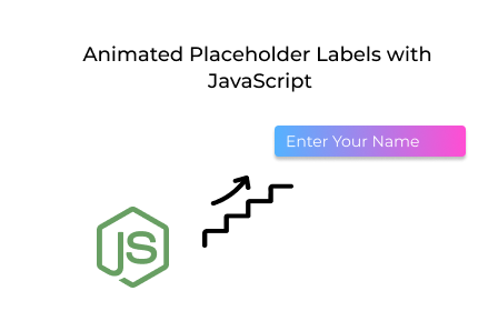
Animated Placeholder Labels with JavaScript: A Stylish UX
Quick answer: Websites with enhanced UI/UX design using animated placeholders and backgrounds see higher engagement, improved accessibility, and a boost in form completion rates.
Websites with enhanced UI/UX design using animated placeholders and backgrounds see higher engagement, improved accessibility, and a boost in form completion rates.
Key Points
- 88% of online visitors are less likely to return after a bad user experience.
- Floating labels can increase form completion rates by up to 30%.
- Sites with animated visuals report 2.6x higher user engagement on landing pages.
Introduction
In the world of custom web development, designing clean and interactive user interfaces is essential. Whether you're building a login page, user portal, or registration system, providing intuitive form elements can make a big difference in how users interact with your website. One such enhancement is the animated placeholder label—also known as the floating label.
This guide will walk you through implementing a glowing animated background, a frosted glass login form, and floating labels using HTML, CSS, and JavaScript. These techniques are increasingly popular in UI/UX design and are a hallmark of quality web development services focused on seamless user interaction.
Whether you're a freelance front-end developer or part of a team delivering custom web development solutions, this design pattern elevates the look and usability of any modern web form.
Why Use Animated Placeholder Labels?
Floating labels offer both aesthetic and functional improvements to traditional web forms. Here's why they’re favoured in UI/UX design and modern front-end development:
-
Maintain label visibility after typing begins
-
Improve accessibility and reduce input confusion
-
Create a minimal, clean layout by avoiding redundant labels
-
Deliver a modern, animated experience for users
Incorporating floating labels is a simple yet impactful enhancement in professional web development services where user experience is a top priority.
Step 1: HTML Structure
This implementation includes:
-
Three full-screen animated background layers (.bg, .bg2, .bg3)
-
A frosted glass form container (.form-card)
-
Input fields with embedded floating labels inside .input-group
-
A JavaScript snippet to toggle label behaviour based on user input
Here’s the HTML layout:
This lightweight JavaScript logic is commonly used in custom web development projects to ensure dynamic behavior across browsers and devices.
Step 2: Creating the Animated Background
To build a captivating background, we layer three divs with subtle animations that simulate glowing movement—perfect for modern web interfaces.
Think of soft, colored lights flowing slowly across the screen, like digital auroras or neon clouds.
This subtle animation effect is frequently seen in UI/UX design for landing pages, hero sections, and login screens—especially in premium web development services.
Step 3: Frosted Glass Login Form
The form uses a blurred glass-like card centered on the screen, enhanced with shadows, soft borders, and entrance animation.
A glowing, translucent panel with a frosted effect gently floats over the animated background, creating a visually distinct and modern login interface.
Using visual enhancements like this is a popular trend in web development services, especially for login portals, admin dashboards and SaaS platforms where first impressions count.
Step 4: Floating Input Labels
Each input field is wrapped in an .input-group. When the user focuses or types in the field, the label floats smoothly to the top.
The label starts inside the input field and rises as the user types, keeping the context visible in a clean, modern style.
Floating labels are a key pattern in UI/UX design, commonly implemented in registration pages, checkout forms, and contact sections across custom web development projects.
Final Words
Combining animated placeholder labels with a glowing background and frosted glass form design creates a visually stunning and functional login interface. These techniques are perfect for enhancing user engagement and visual clarity in any modern website.
For agencies and freelancers offering web development services, integrating such UI/UX design elements shows attention to detail and elevates the overall project quality.
Whether you're building a landing page, a client portal, or a custom web development solution, this design is a practical and stylish choice that keeps users impressed and engaged.
 Frontend
 Backend
 Deployment
Recent Scripts
How to Upload Shopify Theme Assets Using Admin API
 by Bobin
–
May 4, 2026
–
3 minute read
by Bobin
–
May 4, 2026
–
3 minute read
 Request Instant Call
 Hire Remotely