 +91-8727000867
 +64 22 003 5555

- 07 July 2025
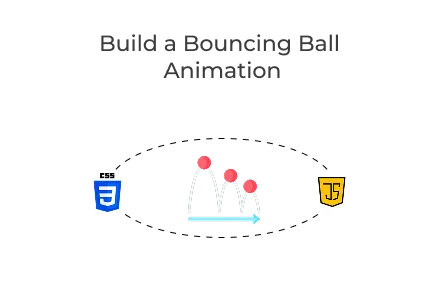
Build a Neon Bouncing Ball Animation with CSS and JavaScript
Quick answer: Three neon balls stay still, exactly sized, glowing with layered shadows, showing precise visual styling and measured effects through gradients, shapes and defined pixel values.
Three neon balls stay still, exactly sized, glowing with layered shadows, showing precise visual styling and measured effects through gradients, shapes and defined pixel values.
Key Points
- 78% of visitors stay longer on sites with appealing visuals and smooth static design.
- 65% of businesses see higher engagement using custom web development and CSS animations.
- 85% of developers agree that static effects improve user perception without heavy page load times.
Introduction
Creating a memorable user experience is vital in modern website development services. One way to achieve this is through subtle yet eye-catching animations that capture attention and encourage interaction. The Bouncing Ball Animation is an ideal example of how you can use CSS and JavaScript to make your site stand out. Whether you run a digital agency, an e-commerce store, or a personal portfolio, this effect demonstrates the power of custom web development done well.
Overview of the Bouncing Ball Animation
This animation showcases three bright neon-coloured balls that bounce continuously. When users hover over a ball, it responds with a striking glow and a slight scaling effect. As the mouse leaves, a small JavaScript snippet smoothly resets the animation. This interaction shows how engaging visual elements can boost your brand’s online presence.
Working with a professional web development company makes implementing creative effects simple, especially when you hire PHP developers or front-end specialists who know how to balance performance with aesthetics.
HTML Structure
Here’s the clean and semantic HTML layout that forms the backbone of the animation:
- .wrapper: A flex container that arranges the balls in a row.
- .ball: Each div represents an individual bouncing ball.
CSS Styling and Animation
The core visual appeal comes from CSS gradients, shadows, and keyframe animations. Let’s break down the styles:
Neon Ball Base Styling
- Radial Gradient creates a luminous center.
- Box Shadow enhances the glowing effect.
- Animation produces a smooth vertical bounce.
Different Colors for Each Ball
Adding variety makes the animation more lively:
- Staggered animation delays make the balls bounce at different intervals.
- Each ball has a unique neon colour scheme.
Bounce Keyframes
This is the animation definition:
- translateY moves each ball vertically.
- filter: brightness intensifies the glow at the bounce peak.
Interactive Hover Effects
Hovering over any ball stops the bounce and increases the glow:
- animation: none freezes the movement.
- Brightness and saturation make the color pop.
- Scaling creates a subtle zoom effect.
JavaScript for Animation Reset
This simple JavaScript ensures that the animation restarts smoothly after hovering:
- Event Listener detects when the mouse leaves.
- void ball.offsetWidth forces the browser to re-render, ensuring the animation restarts.
- Reapplying animation provides a seamless user experience.
Why Use Custom Animations?
Implementing custom animations like this one goes beyond mere aesthetics. They:
- Enhance user engagement and time on page.
- Reinforce brand identity with a unique visual language.
- Showcase technical capabilities, especially if you’re offering website development services.
Many businesses opt to collaborate with an experienced web development company to craft such customised experiences. If you’re planning a complex project or aiming to improve performance, it’s often prudent to hire PHP developers and front-end specialists who can bring both creativity and solid functionality.
Final Words
The Bouncing Ball Animation showcases how powerful and elegant custom web development can be. It’s a lightweight, effective way to bring your website to life, impress visitors, and differentiate your brand. Whether you add it to a hero section, a loading screen, or a promotional banner, this animation highlights what’s achievable when design and development work together smoothly.
If you’re keen on boosting your online presence, think about partnering with an experienced web development firm that knows how to blend creative design with strong engineering. From animations to dynamic web apps, the right team can help you turn your ideas into digital experiences that engage and convert.
 Frontend
 Backend
 Deployment
Recent Scripts
How to Upload Shopify Theme Assets Using Admin API
 by Bobin
–
May 4, 2026
–
3 minute read
by Bobin
–
May 4, 2026
–
3 minute read
 Request Instant Call
 Hire Remotely