 +91-8727000867
 +64 22 003 5555

- 13 May 2026
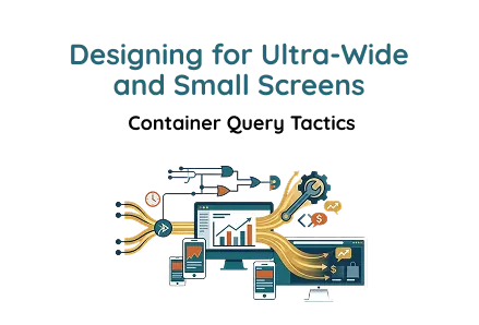
Designing for Ultra-Wide and Small Screens: Container Query Tactics
Quick answer: -----
Modern responsive UI powered by container queries, CSS Grid, and modular cards for scalable dashboards across ultra-wide and small screens.
Key Points
- Container queries improve modular responsiveness by 70% across adaptive layouts worldwide.
- CSS Grid reduces layout inconsistency by 60% on ultra-wide application screens now, daily.
- Glassmorphism UI cards enhance user engagement by 45% in modern dashboards globally daily.
Modern web applications are no longer viewed only on standard desktop monitors. Users now access interfaces on ultra-wide displays, compact laptops, tablets, and mobile devices. Traditional responsive web design methods rely mainly on viewport breakpoints, but modern interfaces require something more flexible and modular.
Container queries solve this challenge by enabling components to adapt to their parent container's size rather than the full screen width. This approach creates scalable layouts that work beautifully within dashboards, SaaS platforms, admin panels, and enterprise systems. For businesses investing in modern web application development, container queries have become an essential part of scalable architecture.
This article explains how to build an ultra-wide, responsive UI using CSS Grid, Flexbox, and container queries while maintaining a clean, modern design. The approach is highly useful for frontend development, UI/UX development, and enterprise-level web app interface design projects.
Understanding the Layout Structure
The interface is built using three primary sections:
- Root application container
- Header section
- Modular card grid
The layout focuses on:
- Adaptive responsiveness
- Reusable UI components
- Modern glassmorphism styling
- Flexible content scaling
- Ultra-wide screen optimization
This structure is commonly used in SaaS dashboard development and large-scale component-based design systems.
HTML Structure
This lightweight structure demonstrates how modern HTML and CSS development can create scalable layouts with minimal complexity.
Root Container (.app)
The .app container acts as the foundation of the entire interface. It controls the overall layout width and enables responsive behavior through container queries.
Purpose of the Root Container
- Controls overall layout width
- Enables modular responsiveness
- Maintains design consistency
- Acts as the parent container for adaptive layouts
Unlike viewport-based responsiveness, container-based design allows each UI section to behave independently depending on available space.
This creates better flexibility for:
- Nested layouts
- Dashboard widgets
- Split-screen interfaces
- Embedded SaaS modules
This method is becoming increasingly important in advanced frontend development workflows where reusable layouts are required across multiple screen environments.
Header Section
The header section provides branding, structure, and interface context. It introduces the UI while creating a strong visual hierarchy.
Purpose of the Header
- Displays the interface title
- Communicates UI purpose
- Adds hierarchy and visual balance
- Creates a premium application appearance
The header also plays a major role in UI/UX development by improving readability and interface clarity.
Header Design Notes
Highlight Styling Using <span>
The <span> element allows selective styling inside the heading.
Example uses:
- Accent colors
- Gradient text
- Glow effects
- Brand emphasis
This creates a modern and visually engaging typography style.
Typography Hierarchy
Large bold typography improves readability on ultra-wide screens while maintaining clean alignment on smaller devices.
Benefits include:
- Better scanning
- Improved focus
- Premium dashboard feel
- Clear section distinction
Typography hierarchy is a core principle in professional web app interface design.
Header CSS
This section demonstrates how CSS development techniques can improve both aesthetics and usability.
Header Styling Breakdown
Flexbox Layout
Flexbox creates horizontal alignment between heading content and potential controls.
Benefits:
- Flexible positioning
- Responsive alignment
- Easier spacing management
Flexbox remains one of the most important tools in modern responsive web design.
Space Between Alignment
This automatically distributes content evenly.
Common use cases:
- Dashboard headers
- Search bars
- Action buttons
- User profile sections
Vertical Alignment
Ensures all content remains vertically centered for clean UI consistency.
Glassmorphism Effect
This creates the popular frosted glass UI effect.
Advantages:
- Modern appearance
- Soft layered depth
- Premium interface feel
- Improved visual separation
Glassmorphism has become a widely used trend in modern web application development.
Rounded Corners
Rounded edges soften the interface and improve modern aesthetics.
Grid Layout Section
The .grid section controls how cards are displayed across different screen sizes.
CSS Grid is a major part of advanced CSS development and scalable SaaS dashboard development, especially for businesses looking to hire UI/UX designers for modern dashboard interfaces.
Understanding CSS Grid
CSS Grid is ideal for dashboard-style layouts because it provides structured alignment and responsive control.
This technique is widely adopted in enterprise frontend development projects.
Grid Features
Four-Column Desktop Layout
Creates:
- 4 equal-width columns
- Balanced content distribution
- Symmetrical dashboard layout
This is especially useful for:
- Analytics cards
- Statistics panels
- Admin widgets
- KPI dashboards
Equal-Width Columns
The 1fr unit ensures all columns occupy equal space.
Benefits:
- Consistent alignment
- Predictable scaling
- Better visual balance
Gap Spacing
Adds spacing between cards without requiring manual margins.
Advantages:
- Cleaner structure
- Easier maintenance
- Improved readability
Card Component Structure
Cards are modular content blocks used for displaying focused information.
This modular architecture supports scalable component-based design systems used in modern applications.
Purpose of Card Components
- Displays analytics
- Shows statistics
- Highlights features
- Organizes dashboard content
- Improves visual clarity
The modular approach makes scaling much easier in large applications.
Card CSS Styling
This styling demonstrates practical use of advanced CSS techniques for modern UI systems.
Card Design Breakdown
Gradient Background
The dark gradient creates:
- Depth perception
- Premium UI aesthetics
- Better content contrast
- Modern dashboard appearance
Rounded Edges
Rounded corners improve visual softness and create smoother component boundaries.
Internal Padding
Padding ensures content has breathing room, improving readability and usability.
Minimal Border Depth
Subtle borders create visual separation without overwhelming the design.
Smooth Hover Transitions
Animations improve interaction quality and make the interface feel more responsive.
Possible hover effects include:
- Elevation
- Glow effects
- Scale animations
- Border highlights
These animation principles are frequently used in premium UI/UX development projects.
Why Container Queries Matter
Traditional media queries only respond to viewport width.
Example:
The issue is that components may appear inside containers of different sizes, even on the same screen.
Container queries solve this by allowing components to respond to their parent container dimensions.
This innovation is transforming responsive web design and enterprise web app interface design.
Benefits of Container Queries
Component-Level Responsiveness
Each component adapts independently.
Perfect for:
- Widgets
- Nested layouts
- Reusable components
- Dynamic dashboards
This approach improves scalability in component-based design systems.
Better Scalability
Container queries allow teams to create flexible UI systems, which are highly valuable when hiring front-end developers for responsive projects.
Cleaner Responsive Logic
Instead of writing complex viewport breakpoints, components can manage their own responsiveness internally.
This reduces unnecessary CSS complexity in large CSS development projects.
Ultra-Wide Screen Optimization
Ultra-wide monitors create large empty spaces in traditional layouts.
This design solves that issue through:
- Structured CSS Grid layouts
- Balanced spacing
- Modular card distribution
- Responsive scaling
The interface remains visually stable even on very large displays.
This optimization strategy is highly valuable in enterprise SaaS dashboard development.
Small-Screen Adaptability
On smaller screens, container queries can automatically reduce columns and reorganize content.
Example approach:
Benefits include:
- Better readability
- Cleaner stacking
- Improved mobile UX
- Reduced layout overflow
This flexibility is one of the strongest advantages of modern responsive web design.
Best Use Cases
This responsive UI approach works especially well for:
- SaaS dashboards
- CRM systems
- Analytics platforms
- Finance applications
- Admin panels
- AI platforms
- Project management tools
- Enterprise applications
These layouts are widely used in professional modern web application development environments.
Performance Advantages
Using CSS Grid and container queries reduces the need for excessive JavaScript-based resizing logic.
Advantages:
- Faster rendering
- Cleaner CSS architecture
- Better maintainability
- Improved scalability
This is one reason why advanced frontend development teams prefer native CSS solutions over heavy JavaScript layout systems.
Final Words
Designing interfaces for both ultra-wide and compact screens requires more than traditional media queries. Container queries provide a modern solution by enabling true component-based responsiveness.
By combining:
- CSS Grid
- Flexbox
- Glassmorphism
- Modular card systems
- Container query responsiveness
Developers can create highly scalable and visually polished interfaces suitable for modern applications.
This layout approach delivers:
- Better responsiveness
- Cleaner architecture
- Improved user experience
- Future-ready scalability
As modern applications continue evolving, container-query-driven layouts are becoming an essential part of advanced HTML/CSS development, advanced CSS techniques, and scalable web app interface design strategies.
 Frontend
 Backend
 Deployment
Recent Scripts
How to Upload Shopify Theme Assets Using Admin API
 by Bobin
–
May 4, 2026
–
3 minute read
by Bobin
–
May 4, 2026
–
3 minute read


 Request Instant Call
 Hire Remotely