Home - Scripts - Website Development
- 08 July 2025
How to Build Responsive Grid Layouts with CSS Grid

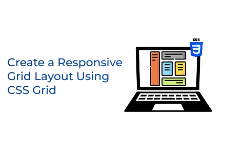
Mastering CSS Grid enables developers to create responsive layouts, improve design consistency, boost accessibility and craft modern websites that perform smoothly across all devices.
Key Points
- CSS Grid cuts layout complexity by 50%, simplifying design and development workflows efficiently.
- Sites using Grid experience 20% higher retention and improved user engagement on all screens.
- Over 75% of designers adopt Grid to create flexible, adaptable, and future-proof website layouts.
Introduction
In today’s digital era, businesses need websites that are not only visually appealing but also flexible, responsive, and simple to manage. This is where a custom website becomes essential, forming a key part of modern business success. Whether you're providing professional website development services and running a leading web development company, mastering modern layout techniques like CSS Grid is crucial.
Creating flexible and responsive layouts is a key component of high-quality custom web development. Among the many tools available, CSS Grid stands out as one of the most powerful and versatile options for building structured, responsive web designs.
In this article, we’ll guide you through creating a responsive grid layout with HTML and CSS, an important skill for developers and teams building professional, scalable websites.
The HTML Structure
Let’s start with the HTML markup:
Why This Structure Matters
This layout uses semantic HTML elements like:
- <header>
- <nav>
- <main>
- <aside>
- <footer>
These tags improve:
Accessibility — screen readers understand your content better.
SEO — search engines favour semantic content.
Maintainability — easier to read, maintain, and scale.
Everything sits inside a layout wrapper so that CSS Grid can control the page structure.
For anyone delivering custom web development services, following semantic and accessible HTML practices is essential.
Styling with CSS
Modern layouts need clean, scalable code. Let’s look at the CSS that transforms our HTML into a polished design.
Base Styling
We begin by setting some foundational styles:
- box-sizing: border-box makes sizing predictable for all elements, critical in professional designs offered by any web development company.
- The body styles reset the default browser spacing and set a modern typeface.
Defining the CSS Grid
The core of our layout is the grid itself:
This setup creates:
- A full-width header
- A three-column middle section
- A full-width footer
Columns are defined as:
- 200px for the navigation sidebar
- 1fr (flexible) for the main content
- 250px for the sidebar on the right
Rows adjust based on their content, ensuring your layout fits any screen height — a critical part of delivering high-end website development services.
Styling Individual Areas
Let’s style each section for visual clarity.
Header
A striking header sets a professional tone, vital for any web development company looking to showcase its brand.
Navigation
Navigation menus are a core component of custom web development, offering users an intuitive way to explore your website.
Main Content
The main content area should always be clean and readable, crucial for any website development services focusing on user experience.
Sidebar
Sidebars are perfect for additional content such as ads, recent posts, or call-to-action links.
Footer
A professional footer provides important information and brand consistency, essential in custom web development.
Making It Responsive
Modern web design requires mobile-first thinking. Here’s how we adjust our layout for smaller screens:
This media query collapses the grid into a single column on devices like tablets and smartphones, ensuring excellent mobile usability. Responsive design is non-negotiable for any web development company offering professional services.
Navigation Styling
Finally, let’s clean up our navigation links:
Clean navigation is a hallmark of good custom web development, improving usability and user engagement.
Why CSS Grid Matters
CSS Grid offers a flexible, modern approach to creating layouts that adjust to any screen. For businesses providing website development services, it’s a game-changer because it:
- Speeds up development
- Keeps code clean and maintainable
- Makes responsive design straightforward
If you’re planning to grow your team or develop sophisticated projects, remember that you can hire PHP developers or front-end specialists skilled in modern technologies like CSS Grid to ensure your website meets the highest standards.
Final Words
Whether you’re developing your own website, working for a web development firm, or providing customised web development solutions, understanding CSS Grid is crucial for contemporary web layouts.
By mastering these techniques, you’ll provide top-notch website development services that stand out for both design and performance.
Looking to scale your next web project? Don’t hesitate to hire PHP developers or skilled front-end professionals who can use tools like CSS Grid to turn your vision into reality.
 +91-8727000867
 +64 22 003 5555


 Frontend
 Backend
 Deployment


 Request Instant Call
 Hire Remotely
