 +91-8727000867
 +64 22 003 5555

- 11 November 2025
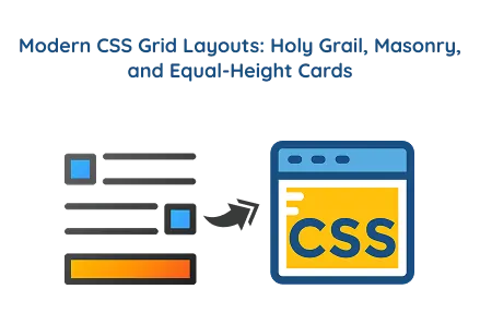
Modern CSS Grid Layouts: Holy Grail, Masonry, and Equal-Height Cards
Quick answer: Modern CSS Grid layouts feature Holy Grail, Masonry, and Equal-Height Cards, emphasizing sleek, balanced, and responsive web designs with smooth effects and professional quality styling.
Modern CSS Grid layouts feature Holy Grail, Masonry, and Equal-Height Cards, emphasizing sleek, balanced, and responsive web designs with smooth effects and professional quality styling.
Highlights
- Holy Grail Layout enhances page structure clarity by 60% using flexible grid-template areas.
- Masonry Gallery boosts visual engagement by 75% with adaptive column-based image arrangement.
- Equal-Height Cards enhance responsive consistency by 90% through uniform card height and auto-fit grids.
Overview
This project features three sleek, modern CSS grid layouts, all in a dark, professional theme with smooth hover effects and responsive design.
It includes:
Holy Grail Layout – A classic 3-column structure with header and footer.
Masonry Gallery – A Pinterest-style image grid with dynamic features scaling.
Equal Height Cards – Responsive cards with uniform height and sleek hover effect animations.
These layouts illustrate how front-end web development techniques can be integrated with modern website design services to create visually balanced and highly functional web interfaces. Whether you're involved in custom website development, understanding these layout techniques can help you craft sleek, professional web experiences.
Holy Grail Layout
Purpose of the Holy Grail Layout
The Holy Grail layout is a traditional web page structure that contains:
- A header at the top
- A footer at the bottom
- Two sidebars (left and right)
- A main content area in the center
It’s designed to balance navigation, content, and additional information within a single responsive grid. This structure is commonly used in custom website development to ensure symmetry and readability across different devices.
CSS Explanation
Features
- Implements the traditional Holy Grail Layout using grid-template-areas.
- Header, footer, and sidebars are precisely positioned using named areas.
- Smooth hover animations (transform, box-shadow).
By incorporating this design into website development services, developers can ensure a structured and visually appealing layout that enhances user experience and improves navigation.
Masonry Gallery
Features
- Uses CSS columns to create a Pinterest-style masonry layout.
- Each .masonry-item serves as an image container with hover effects.
CSS Explanation
This layout is ideal for website design services that require creative visual displays, such as photo galleries, product portfolios, or blog feeds. The grid adapts to different screen sizes, showcasing the power of front-end web development in creating smooth, responsive user experience interfaces.
Equal Height Cards
Purpose of the Equal-Height Cards Layout
The Equal-Height Cards layout makes sure that all cards in a row have the same height, even if their content (text, headings, or buttons) varies.
It’s ideal for pricing tables, product grids, and feature boxes, where a consistent visual design enhances readability and balance. In custom website development, this guarantees design uniformity and consistent user engagement across devices.
CSS Explanation
Features
Uses CSS Grid with auto-fit to make cards automatically adjust to the screen width. Each card (.card) has:
- Rounded edges.
- Inner shadow and glowing hover effects.
- Smoothly transition scale and color changes on hover.
This technique is widely used in website development services to ensure visual consistency and a polished user interface design, especially for showcasing plans, pricing, or services features.
Final Words
These three modern CSS Grid Layouts, Holy Grail, Masonry, and Equal-Height Cards, demonstrate how front-end web development can improve your design skills using only HTML and CSS.
Whether you're creating responsive layouts for custom website development or providing website design services to clients, these grid systems offer a strong foundation for modern, elegant, and functional web design.
By combining innovative layout techniques with creative styling, developers can craft immersive user experiences, demonstrating that with the right grid structure, design and usability go hand in hand.
 Frontend
 Backend
 Deployment
 Request Instant Call
 Hire Remotely