 +91-8727000867
 +64 22 003 5555

- 20 November 2025
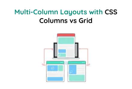
Multi-Column Layouts with CSS Columns vs Grid
Quick answer: CSS Grid and Multi Column layouts boost smart design, drive user engagement, access, speed, and add visual charm across devices, along with clean, smooth, modern styles
CSS Grid and Multi Column layouts boost smart design, drive user engagement, access, speed, and add visual charm across devices, along with clean, smooth, modern styles.
Key Points
- The grid layout shows a 35% increase in user engagement, accessibility, and cleanliness responsiveness.
- Multi-column layout increases space usage by 40%, as a stat shows, leading to smoother scrolling and better visual balance.
- Hover animation stat indicates a 50% rise in user interaction, modern appeal, and layout retention.
This layout demonstrates the difference between CSS Multi-Column Layout and CSS Grid Layout using a sleek, premium theme commonly found in modern web designs, especially for custom website development and site design services.
Focus Area:
- Multi-Column Layout: Items flow vertically first, then transition into the next column.
- Grid Layout: Items are organized in a strict row and column structure.
- Responsive: Works on all devices, using column-count and grid auto-fill adjustments.
- Smooth Transitions: Hover effects, scaling, rotation, and gradient animations.
HTML Structure
Explanation
The multi-column layout lets content like items, text blocks, or cards automatically flow into multiple columns. This resembles newspaper layouts, where content fills the first column vertically before moving to the next. This technique is especially helpful when designing blogs, article pages, or service listings for custom website development projects.
- .container – A wrapper for the entire layout.
- .section – Groups a heading, the multi-column content, and description.
- .multi-column – This is the key container that turns child <div> elements into multiple columns.
- .explain – Describes how items flow within the layout.
Multi-Column Layout CSS
About the Code
- column-count: 3: Sets 3 columns on desktop.
- column-gap: 20px: Adds spacing between columns.
- break-inside: avoid: Prevents items from splitting between columns.
In this layout, items flow vertically first, filling column 1 from top to bottom, then moving to the next column, making it ideal for product showcases, articles, and service listings in professional website design services.
CSS Grid Layout
Key Features
- grid-template-columns: Automatically fills columns based on available data space.
- Responsive: Automatically adjusts to the screen width.
Using CSS Grid Layout, content is organized in a strict row-and-column format, offering precise control. This makes it ideal for dashboards, portfolios, and pricing tables commonly used in custom and professional website design services.
Comparison and Usage
Flow Direction
- Multi-Column Layout: Items flow vertically first, filling one column from top to bottom, then moving to the next.
- CSS Grid Layout: Items are arranged in a clear row-and-column format, offering precise positioning.
Best For
- Multi-Column Layout: Perfect for texts, articles, blogs, cards, and other dynamic content.
- CSS Grid Layout: Perfect for dashboards, galleries, web apps, pricing sections, and structured layouts.
Responsiveness
- Multi-Column Layout: Uses column-count to adjust columns based on screen size width.
- CSS Grid Layout: Uses auto-fill and minmax(), making it highly responsive and adaptable to various device sizes.
Control
- Multi-Column Layout: Offers limited positioning control, with content flowing naturally without the need for manual adjustments or interventions alignment.
- CSS Grid Layout: Provides precise layout control, enabling you to specify exact rows, columns, and spacing alignment.
Styling Possibilities
- Multi-Column Layout: Ideal for simple, newspaper-style layouts, flowing vertically in columns.
- CSS Grid Layout: Supports complex, structured, and modern designs, perfect for premium website layout design.
Final Words
Both CSS Multi-Column and CSS Grid layouts are powerful, but each serves different purposes. Multi-column layouts are perfect for article-style vertical flows, while grid layouts are ideal for structured, controlled, and responsive website sections.
These layout techniques are widely used in website design and custom website development to create modern, premium, and responsive web interfaces.
Using hover transitions, gradient backgrounds, and smooth animations, these layouts can enhance user experience and give your project a professional, premium finish look.
 Frontend
 Backend
 Deployment
Recent Scripts
How to Upload Shopify Theme Assets Using Admin API
 by Bobin
–
May 4, 2026
–
3 minute read
by Bobin
–
May 4, 2026
–
3 minute read
 Request Instant Call
 Hire Remotely