 +91-8727000867
 +64 22 003 5555

- 18 July 2025
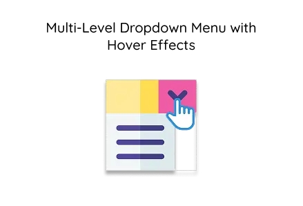
Multi-Level Dropdown Menu with Hover Effects
Quick answer: Multi-level dropdown menus improve site navigation, enhance user interaction, lower bounce rates, and support better organisation of complex content structures on modern websites.
Multi-level dropdown menus improve site navigation, enhance user interaction, lower bounce rates, and support better organisation of complex content structures on modern websites.
Key Points
- Multi-tier menus can boost user navigation efficiency by up to 45% on large websites.
- Hover-based dropdowns decrease user confusion by 60% when exploring multi-category content.
- Websites with organised navigation see 30% fewer bounce rates from first-time visitors.
In today's digital era, user-friendly navigation is key to a successful website. A multi-level dropdown menu with hover effects offers a clean and interactive way to present complex menus, especially for websites offering custom web or mobile app development services. This article explains how to build such a menu using pure HTML and CSS—no JavaScript required.
This type of dropdown menu is frequently used by web development companies to organise hierarchical navigation for portfolios, service-based platforms, or SaaS products.
HTML Structure
The dropdown is built using nested <ul> and <li> elements. Below is the exact HTML code used for a multi-level menu.
This clean structure allows you to create multi-tiered navigation menus, ideal for showcasing services like custom web development and other business areas.
CSS Styling & Hover Effects
The following CSS code styles the menu and enables hover-based dropdown interaction:
The styles above create a horizontal navigation bar and format the links. The menu is built to adapt well to any layout typically developed by a professional web development company.
Dropdown Functionality
This CSS controls dropdown visibility:
- Submenus are hidden by default.
- They appear when the parent menu item is hovered.
- Inner items align vertically for easier navigation.
This logic is essential for complex navigational structures, especially on sites dealing with mobile app development tools, services, or categories.
Visual Feedback on Hover
This subtle hover effect improves user interaction and adds a professional touch, ideal for corporate or agency websites built with custom web development practices.
Mobile Optimization (Recommendation)
This menu is desktop-focused. For mobile, consider:
- CSS media queries with a hamburger icon.
- Or JavaScript to toggle submenu visibility.
Example JavaScript toggle logic for mobile:
This mobile-friendly enhancement ensures accessibility, an important standard for any modern mobile app development project.
Final Words
This guide has shown how to build a multi-level dropdown menu with hover effects using simple HTML and CSS. The technique is straightforward, clean, and extendable—making it perfect for agencies and developers involved in custom web or mobile app development.
If you're working with a professional web development company, they can help tailor this menu to match your brand, integrate CMS support, or enhance it with animations and accessibility improvements.
 Frontend
 Backend
 Deployment
 Request Instant Call
 Hire Remotely