 +91-8727000867
 +64 22 003 5555

- 18 June 2025
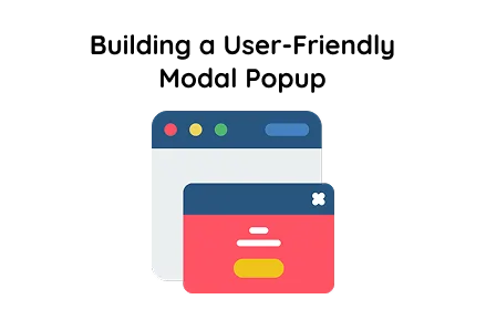
Step-by-Step Guide to Building a User-Friendly Modal Popup
Quick answer: Modal popups help websites engage visitors better, increase conversion rates, and reduce bounce rates, improving user experience and site performance.
Modal popups help websites engage visitors better, increase conversion rates, and reduce bounce rates, improving user experience and site performance.
Key Points
- Modal popups increase conversion rates by 30% by encouraging visitor actions.
- User engagement grows by 70% when modal popups are used effectively.
- Bounce rates drop by 20% on sites using well-designed modal popups.
This tutorial demonstrates how to create a smooth, responsive modal popup using standard web technologies: HTML, CSS and JavaScript. The modal popup is styled with a clean custom font and offers a seamless user experience. This example is ideal for those seeking website development services or looking to hire PHP developers for custom web projects.
HTML Structure
Button:
This button is prominently displayed on the page. Once clicked, it triggers the opening of the modal popup, providing an interactive way to display additional content without leaving the current page.
Modal Overlay and Box:
The outer div acts as a full-screen overlay with a semi-transparent background, ensuring the modal box stands out. Inside it, the .modal box contains the actual content, including a heading, a descriptive paragraph, and a close button.
CSS Styling Details
Fonts:
Multiple Google Fonts are imported, with the main font used being "Lexend Deca". This font choice ensures readability and a modern look that fits perfectly in contemporary web applications, a must-have in any custom web development project.
Body Styling:
The entire page uses Flexbox to centre the modal trigger button both vertically and horizontally against a calm blue-grey background, offering a professional and polished interface.
Button Styling (.open-btn):
The button has a light green background with rounded corners and a subtle shadow to make it inviting. On hover, the button’s background colour changes smoothly, encouraging user interaction.
Modal Overlay (.modal-overlay):
The overlay covers the entire viewport with a fixed position and a semi-transparent black background. Initially, it is hidden using display: none to keep the UI clean until triggered.
Modal Box (.modal):
The modal container has a clean white background, generous padding, rounded corners, and a subtle box shadow for depth. It features a smooth slide-down animation, providing an elegant entry effect that enhances user experience.
Close Button (#closeModal):
Styled with a consistent blue background and white text, the close button spans the full width of the modal footer area. It also changes shade on hover to indicate interactiveness.
Animation (@keyframes slideDown):
This keyframe animation allows the modal to slide down gently from the top when it appears, adding a touch of smoothness that is often expected from professional website development services.
JavaScript Functionality
Opening the Modal:
When the user clicks the button, the modal overlay becomes visible by changing its CSS display to flex, allowing the modal box to appear with its styled animation.
Closing the Modal:
There are two ways to close the modal:
Close button inside the modal:
This ensures users have a friendly and intuitive way to dismiss the modal popup, improving overall site usability, an important aspect when offering custom web development.
Final Words
This modal popup implementation showcases a responsive, user-friendly and modern design that can be easily integrated into any web project. Using HTML for structural elements, CSS for layout, styling and animation or JavaScript for dynamic open/close functionality
This approach is perfect for businesses looking to hire PHP developers or partner with a reliable web development company to enhance their websites with interactive components such as modal popups. Leveraging such features can significantly improve user engagement and create a professional appearance, key for any successful online presence.
 Frontend
 Backend
 Deployment
Recent Scripts
How to Upload Shopify Theme Assets Using Admin API
 by Bobin
–
May 4, 2026
–
3 minute read
by Bobin
–
May 4, 2026
–
3 minute read
 Request Instant Call
 Hire Remotely